


Visual Climate Center
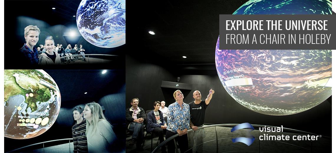
Science On a Sphere is a dynamic animated globe, colloquially called "The Globe" that uses an advanced technology to visualize images of the atmosphere, the oceans and the continents, the moon and the solar system, as well as it tells and shows – in a very plain and thoughtful way – how the world is changing due to the climate.
Data for Science On a Sphere is provided by NOAA and NASA and are updated weekly. The Globe can display a myriad of data; we have over 800 datasets, right from water levels in the past, present and in the future to Facebook's interactions for example.
“Knowledge about climate changes can be difficult to transmit. The substance can be a little unclear to relate to, which is why some of the most important is: visualization”
- Jesper Theilgaard, Danish Meteorologist
 +45 40 19 07 85